9 Dinnerware Sets That Look More Dated Than Chic
Some dinnerware sets can make your table look dated instead of stylish. From heavy stoneware in dark tones to floral china that feels more old-fashioned than elegant, certain designs tend to age faster than others. These sets might remind you of another decade rather than a modern dinner table. Here are some examples that lean more toward dated than chic.
This post may contain affiliate links, which helps keep this content free. Please read our disclosure for more info.
16-Piece Brown Stoneware Dinnerware Set
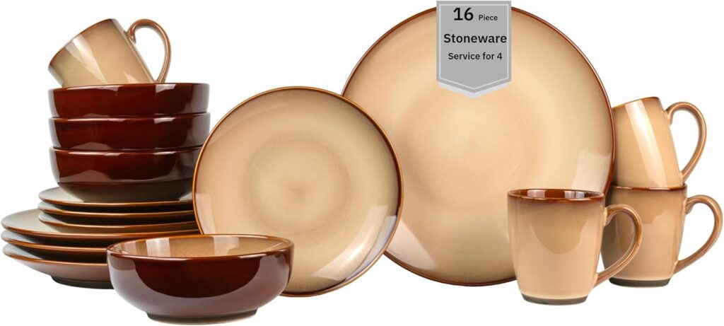
This heavy stoneware set in deep brown shades feels like something straight from a 1970s kitchen. Its thick plates and glossy finish give it a weighty appearance that doesn’t blend well with modern minimalist tables. While some might call it rustic, the color and bulk make it look more tired than timeless. The uniform dark tone can make a dinner spread look dull instead of warm and inviting.
The set may hold up well for everyday use, but style-wise, it feels stuck in another era. Many homes have moved toward lighter neutrals and matte finishes that feel softer and fresher. Brown stoneware, with its dense glaze and dated tone, often dominates a table in a way that looks heavy-handed. It’s durable, yes, but far from current in design.
Claytan Windmill 16-Piece Dinnerware Set
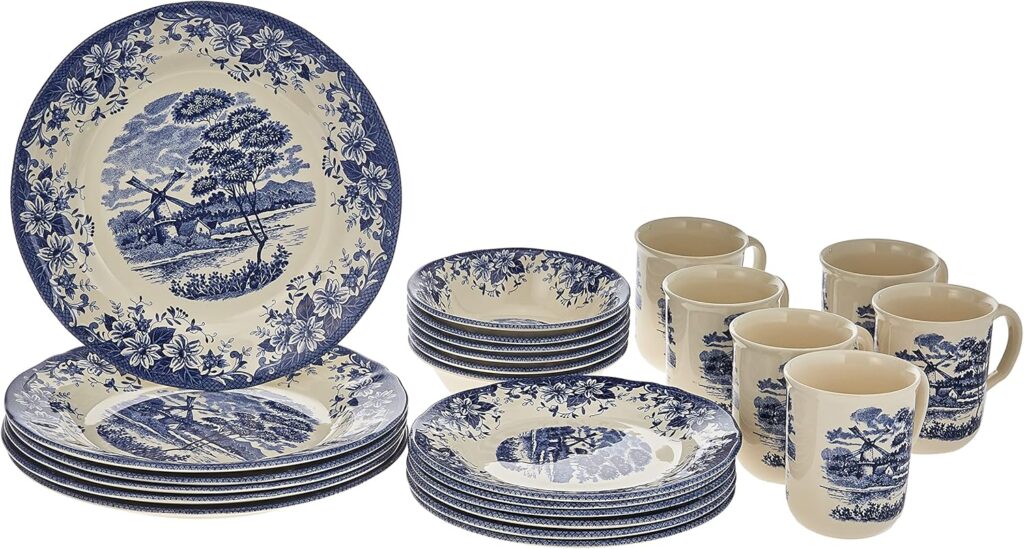
The old-fashioned windmill pattern instantly gives away this set’s dated charm. Its delicate blue-and-white print resembles dinnerware from mid-century homes or country diners. While nostalgic for some, the repetitive pattern looks fussy next to today’s cleaner, more balanced designs. The glossy finish adds to the vintage look, rather than updating it.
Though it may spark fond memories, it doesn’t translate well in modern kitchens. Many current dinnerware trends lean toward subtle textures or solid tones that let food stand out. The windmill motif distracts from what’s on the plate and can clash with simple table linens. It’s best kept as a collectible rather than an everyday set.
FÄRGKLAR 10-Piece Service
IKEA’s FÄRGKLAR set may be affordable, but its look can read more basic than stylish. Its glossy colors, often in shades like mustard or dark teal, feel a bit too familiar from older kitchenware. The shapes are smooth but lack the character of newer handmade-style ceramics. It’s functional but doesn’t bring much personality to the table.
Although simplicity can be elegant, this version feels flat instead of refined. The lack of texture makes it appear mass-produced rather than thoughtfully designed. With so many modern matte or speckled options available, this glossy set looks like something from a past catalog. It’s dependable for everyday use but far from trend-forward.
Larah by Borosil Blue Iris Dinner Set
This set’s blue iris floral print might appeal to nostalgic tastes, but its style feels straight out of the 80s. The delicate blossoms and crisp white base once symbolized elegance but now feel overly formal. It’s the kind of dinnerware that reminds people of china cabinets rather than open shelving. Its lightweight build adds to the dated impression.
While florals never go out entirely, the way they’re printed here feels static and ornamental. Newer designs often use watercolor washes or abstract patterns for a fresher take. This set’s high-contrast look feels more like a keepsake than a piece for modern tables. It’s decorative, yes, but far from current in spirit.
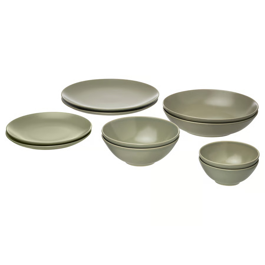
VÄRDERA 18-Piece Dinnerware Set
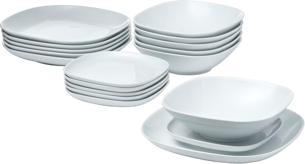
The VÄRDERA set offers clean white porcelain but lacks the subtle texture that gives newer designs depth. Its glossy finish can make it appear generic and uninspired, similar to restaurant dishware. Though its durability is a plus, the style feels plain and slightly outdated. There’s little here that adds charm or warmth to the table.
Some minimal dinnerware can feel timeless, but this version borders on sterile. Without any curve or texture, it misses the handmade softness that defines modern Scandinavian aesthetics. It’s practical, yes, but feels more like a work canteen set than a home table feature. A matte surface or organic edge would give it a fresher feel.
Gibson Elite Soho Lounge Reactive Glaze Stoneware Dinnerware Set
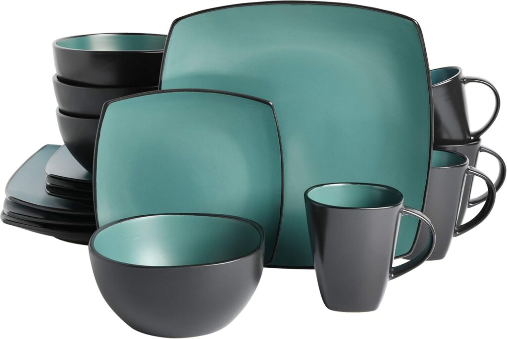
This set once looked modern, but its thick reactive glaze now feels heavy and dated. The two-tone look, with darker edges fading into lighter centers, was everywhere a decade ago. While it adds depth, the overall appearance feels overdone and glossy. The square plates that often come with this set make the look even more of a throwback.
For people who like a rustic mood, it still works, but it doesn’t blend well with newer decor. The glossy glaze can look uneven in harsh lighting, giving it an older vibe. Modern tables tend to lean toward subtle gradients or matte glazes instead. This one feels more like a trend from the past than a style returning in fashion.
Gibson Elite Tequesta Square Reactive Glaze Stoneware Dinnerware Set
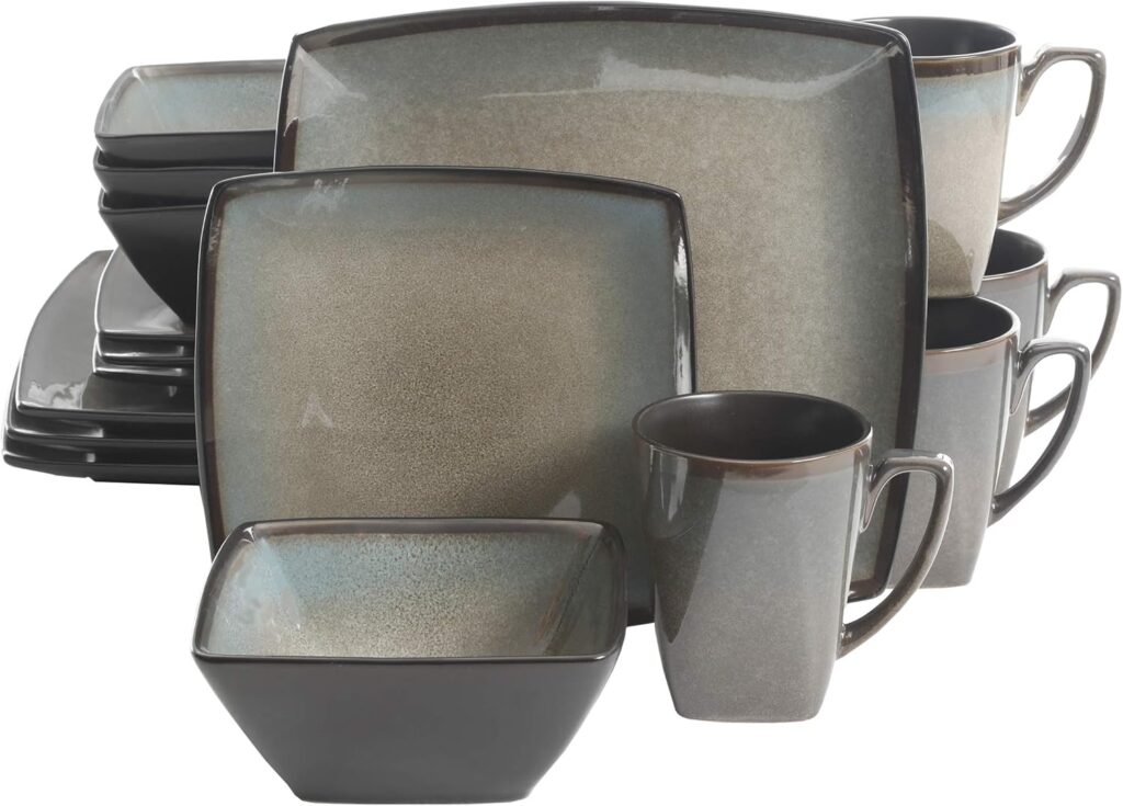
Square plates had a big moment in the 2000s, and this set is a clear holdover from that era. The reactive glaze, often in beige or deep blue, adds to the dated aesthetic. While it tries to make a bold statement, the mix of square shapes and glossy surfaces feels mismatched today. The overall look leans more corporate dining than cozy home meal.
Though still sold widely, it doesn’t match current table trends that favor rounded, organic shapes. The sharp corners and thick glaze look more decorative than functional. It’s durable, yes, but its bulky lines make the dining setup look rigid. It’s a reminder that design trends can age fast when they rely too much on shape gimmicks.
Vintage Gold-Rimmed Porcelain Dinner Set
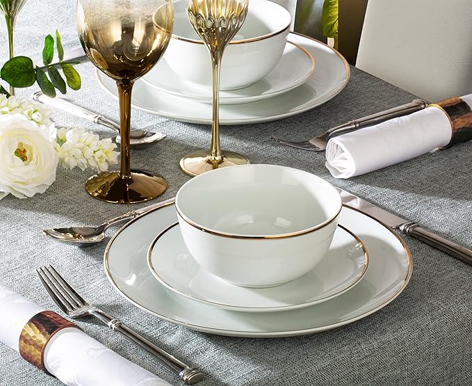
This porcelain dinner set with gold trim feels too formal for most modern tables. The reflective band and bright white base recall hotel dining rooms or wedding china from decades past. While once a symbol of fine taste, the high-shine edge now feels dated and overly polished. It lacks the relaxed warmth that today’s tables often highlight.
The thin metallic border can also wear unevenly over time, adding to its aged look. Many people now prefer soft metallic glazes or hand-painted details that feel less rigid. Though it still photographs nicely, in person it often reads as stiff and old-fashioned. It’s elegant in theory, but hard to blend with a casual or natural dining style.
Tuscan Fruit Motif Ceramic Dinner Set
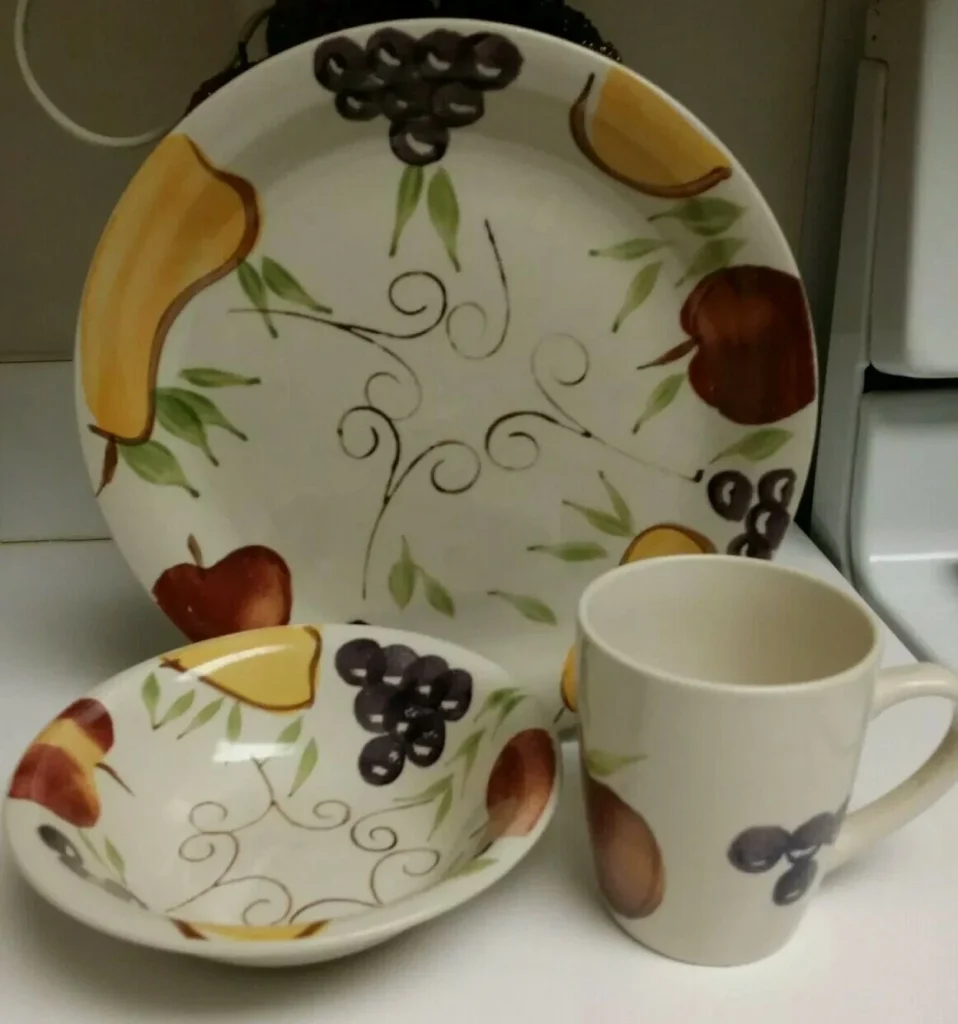
This ceramic set covered in grapes, olives, and vines instantly brings to mind early-2000s kitchen decor. The bright fruit border and glossy finish once filled countless Italian-themed dining rooms. Now, it feels like a leftover from a restaurant display rather than a home table. The busy pattern distracts from the food and dominates the setting.
While cheerful, the design feels overworked next to the soft, neutral palettes that define current tableware. The glossy glaze and heavy colors make it look loud rather than inviting. It can still work in a themed space, but it doesn’t suit today’s simple, textured approach. In modern dining rooms, this set feels more nostalgic than fresh.
This article originally appeared on Avocadu.