8 Postcards With Printing Oddities That Became Valuable Collectibles
Hidden in shoeboxes and old albums, postcards with odd printing mistakes can quietly gain serious value. Some show ghostly shadows where an image printed twice, while others have upside down captions or missing colors that make them unique. As you read this article, you will start to recognize the clues that separate a simple tourist card from a collectible misprint.
This post may contain affiliate links, which helps keep this content free. Please read our disclosure for more info.
Travancore Rama Varma Narma Name Error Picture Postcard
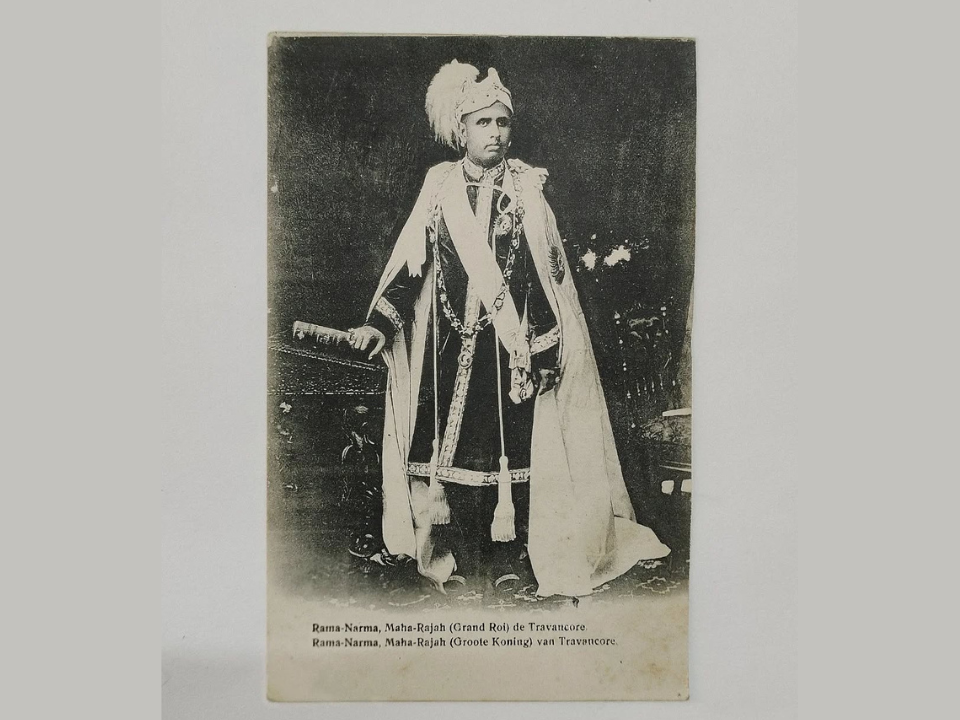
From the princely state of Travancore in India, a portrait postcard of Maharaja Sree Chithira Thirunal Rama Varma carries a memorable spelling slip. Printed in Germany in the early twentieth century, the caption under the ruler’s name reads Rama Narma instead of Rama Varma. This simple letter swap turns a standard royal portrait into a talked about error within collectors of Indian material. Prices around $60 to $70 have been recorded for nice examples, which is noticeably higher than ordinary royal cards of the same era.
Among specialists, this card draws smiles because the mistake hides in plain sight until someone reads the caption closely. The combination of dignified studio portrait and wrong name gives it both historical interest and hobby charm. Well centered, lightly handled copies with clear print are the ones that sell most quickly when a dealer offers them.
Merrimac River From Swett’s Hill Haverhill Caption Error Card
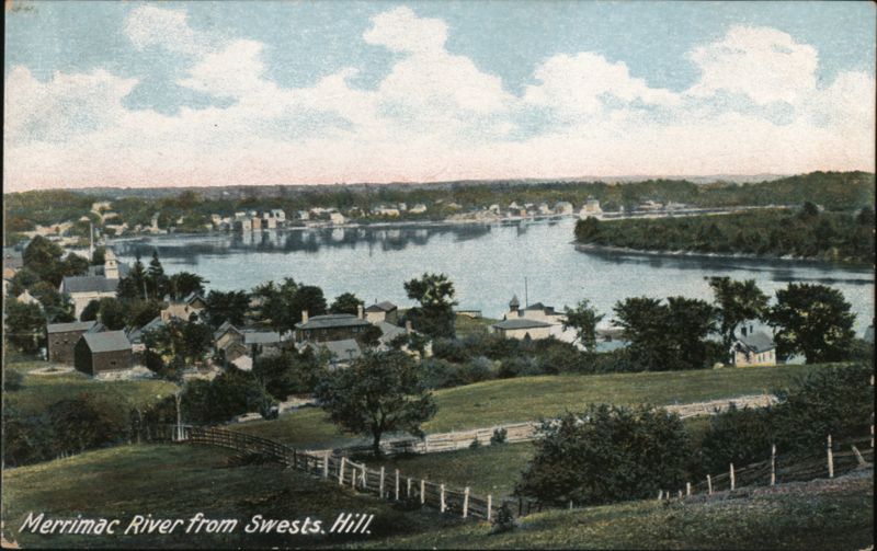
Within American town views, the Haverhill, Massachusetts postcard showing the Merrimac River from Swett’s Hill hides a small but charming misprint. Published by Hugh C Leighton Company around 1911, it presents a calm river scene with the hill named in the caption. On this variety, the title reads Swest’s Hill instead of Swett’s Hill, and a past owner even corrected the spelling by hand on at least one recorded card. Dealers have offered this miscaptioned view around $15 to $20, which is several times the price of a normal Haverhill river card.
Local collectors enjoy this card because it ties a real place to a very human printing mistake. The handwritten correction on some examples adds a personal touch that shows someone noticed and cared. Cards with good color, sharp corners, and a legible error line hold the strongest appeal in New England town view collections.
They Took My Change Curt Teich Comic Card With Barrely Misprint
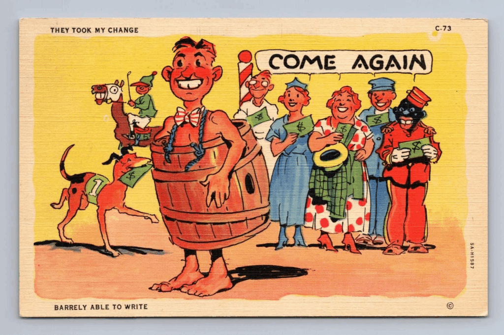
Comic postcards by Curt Teich already draw attention, and this linen era joke card titled They Took My Change adds an extra twist. The Ray Walters artwork shows a man in a barrel with a crowd of people, paired with the caption They Took My Change and a second line intended to say Barely Able to Write. On the printed version, that line appears as Barrely Able to Write, turning the typesetter’s slip into part of the joke. Nice examples often sell near $15 to $20, more than many ordinary linen comics.
Humor collectors appreciate how the misprint fits the gag about poor writing skills. The mistake came at the lettering stage rather than from ink shift, so every card from that run repeats the extra r. Crisp linen texture, bright colors, and clean edges keep this lighthearted error card attractive to buyers.
Stratford Town Hall Chrome Card With Florida Style Back Copy
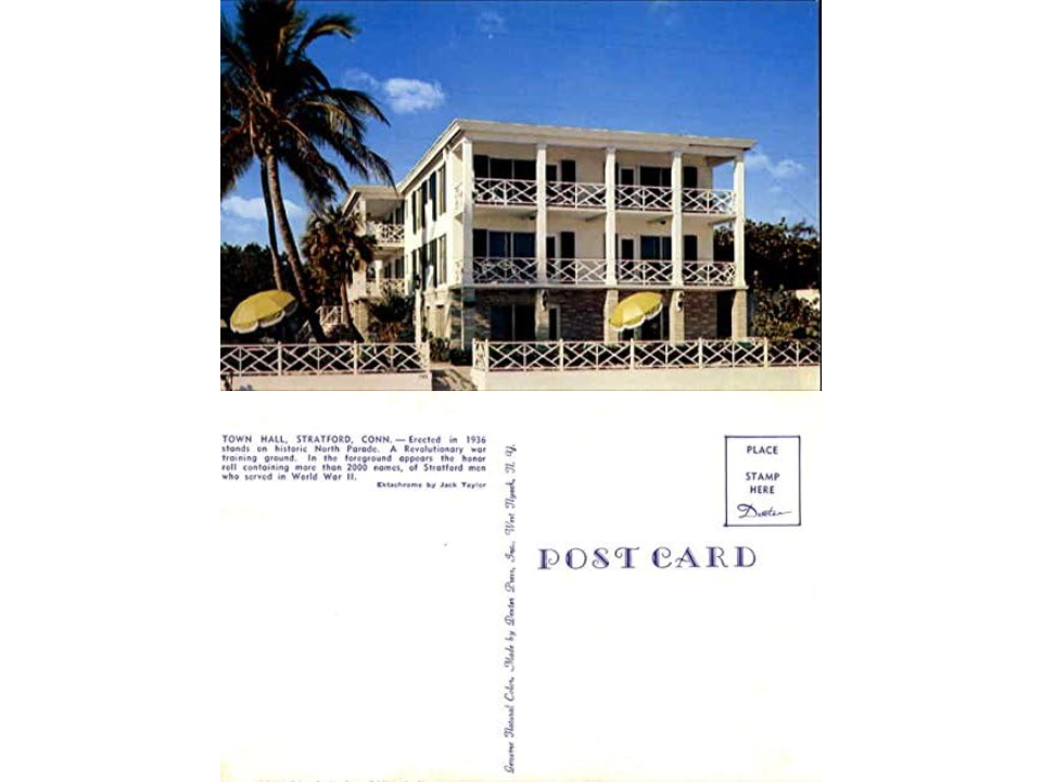
A chrome postcard of Stratford Town Hall in Connecticut gives another example of front and back content that do not agree. The glossy front shows the civic building in typical mid century color, credited to Dexter Press. On the back of the misprint variety, the text reads like a description of a resort or hotel, complete with decorative parade grounds and restaurant atmosphere, which does not match a New England town hall. Cards from this mix up have been priced around $5, higher than standard chrome town hall views.
People who collect municipal buildings like this card because it hints at the busy production tables where multiple projects were being assembled. The wrong back copy probably came from a holiday or hotel card that shared a similar layout. Glossy surfaces without heavy scratches and a clean, readable error text keep buyer interest strong.
Poland Spring House Real Photo Card With Garbled Back Imprint
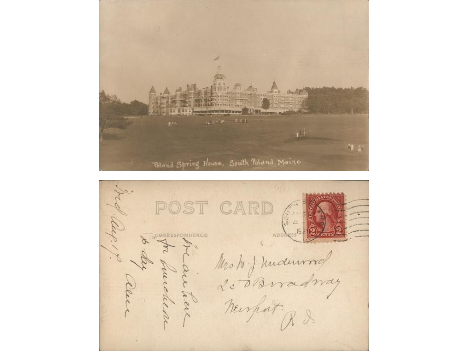
From South Poland, Maine, a real photo postcard of Poland Spring House carries a printing glitch on the back instead of the front. The photograph of the grand hotel is sharp and attractive, showing the famous resort and its surroundings. On the reverse, part of the standard Post Card legend and address panel prints as a line of nonsense characters where normal words should appear. A dealer has valued such an example near $20, above many ordinary resort real photo cards.
Error hunters like this card because the misprint is easy to see yet does not spoil the picture itself. The fault likely came from damaged type or a worn plate, leaving broken letters where clear instructions should have been. Strong photographic contrast on the front plus a clearly garbled line on the back make for a satisfying addition to hotel and spa themed pages.
Bird’s Eye View Of Mirror Lake, Lake Placid Misprint Variety
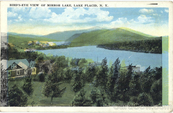
From Lake Placid, New York, a bird’s eye view of Mirror Lake stands out when dealers file it under misprints rather than routine scenery. The white border card shows hills, water, and a town from an elevated point, with a standard style caption naming the lake. On certain copies, small differences in wording, punctuation, or color registration set them apart from more common printings, leading dealers to treat them as a variety. Values for such misprint views often fall around $10 to $20, higher than many everyday Adirondack lake cards.
Collectors who enjoy subtle printing changes use cards like this to show how small alterations can occur across print runs. Slight shifts in ink alignment, missing punctuation, or a modified title line give them something to compare in albums. Clean paper, strong color, and a clearly legible caption help the variety status feel worthwhile when shown to others.
Ben Franklin Oldhams Virginia Ink Shift Error Postcard
From Oldhams, Virginia, an antique postcard featuring Benjamin Franklin includes another printing issue that affects the design itself. The card uses a stamp-like portrait of Franklin along with local text, but part of the ink layer sits slightly out of place, giving a doubled outline to some lines and letters. This shift shows most clearly along borders and text where crisp printing would normally appear. An example has been offered near the $20 to $25 mark, which is higher than many small town Virginia views.
Collectors of printing shifts and philatelic themes like this card because the error shows up right on Franklin’s image. The doubled effect highlights how printing plates or cylinders can move slightly during production. Cards that still show strong color and only light handling are the most appealing, since they let the ink shift remain the main focus.
Erastus Deaf Smith History Card With Caption Quirk
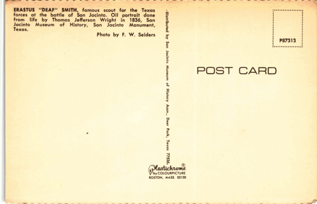
Texas history collectors pay attention to a postcard showing Erastus Deaf Smith that carries a small but noted caption oddity. The divided back card presents his portrait along with a line about the San Jacinto monument and the museum that holds related items. In some printings, the use of quotation marks around Deaf or the way line breaks fall in the text differs from standard versions, which has led dealers to group it among caption errors. Values in the tens of dollars have been recorded, higher than many routine historic portraits.
People who collect Texas heroes appreciate how even tiny text details can turn one card into a special variety. The different caption layout gives them an excuse to show side by side comparisons at club meetings. Cards with strong printing, undamaged backs, and clear wording remain the most desirable when it comes to this small caption variation.
This article originally appeared on Avocadu.